Role: UX Researcher & Designer
Timeline: Academic project
Tools: Interviews, Competitive Analysis, Figma, Usability Testing
Overview
I explored how people learn vocabulary and languages, and how a mobile experience could support learning during short moments like commuting.
The goal was to design a motivating, low-pressure learning experience that fits into everyday life.
The Problem
Most vocabulary and language learning apps fall into one of these traps:
- They rely heavily on ads and paywalls
- Learning sessions are too long
- Progress feels punishing instead of motivating
I wanted to explore how vocabulary learning could feel lightweight, engaging, and flexible without adding pressure or guilt.
Competitive Analysis
I analyzed existing learning apps to understand how they approach onboarding, motivation, and vocabulary retention.
Vocabulary – The good

Vocabulary – The bad

Anki – The good

Anki – The bad

Key insights
- Gamification increases motivation but can also create stress
- Clear progress tracking keeps users engaged
- Monetization is a major frustration
- Most apps focus on isolated words instead of real usage
User Interviews
I interviewed multiple participants with different backgrounds and learning habits (professionals, teachers, researchers).
All participants have been anonymized.
Summaries
Tom

Martin

Nora

What I learned
- People want to learn during “dead time” (commutes, short breaks)
- Vocabulary sticks better when used in context
- Structure helps, but flexibility is essential
- Ads and streak pressure often lead to drop-off
Defining the User
Based on the research, I created a proto-persona representing busy, goal-oriented learners.

Problem statement
Busy learners need a way to practice vocabulary in short sessions without feeling punished by ads, streaks, or rigid schedules.
Solution Concept
Swords and Words (working title)
I designed a gamified vocabulary learning app where users actively learn words by typing them during short game rounds.

Core principles
- Short, repeatable sessions
- Clear progression and XP
- Learning through action, not passive reading
- Optional help from mentors or higher-level players
User Flow & Prototype
The experience was designed to be simple and linear:
- Sign up or log in
- Choose language and level
- Play a short vocabulary round
- Review learned words
- Return to the game board


Usability Testing
I ran remote usability tests focusing on:
- Sign-up flow
- Game loop clarity
- Navigation (profile & vocabulary upload)
Martin

Johannes

Nora

What worked
- Sign-up was fast and intuitive
- The game concept was easy to understand
Pain points
- Too many menus
- Game loop felt too long
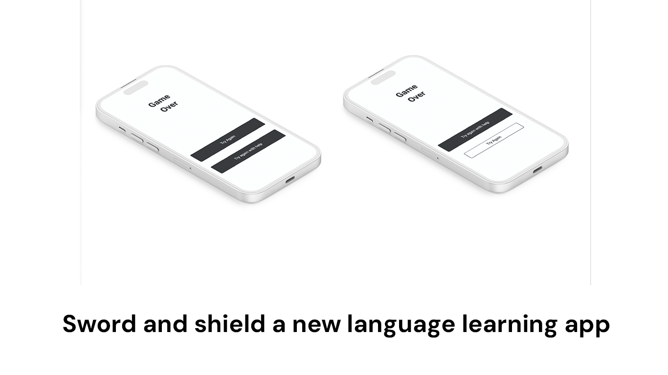
- Button hierarchy was unclear
Iteration & Improvements
Based on feedback, I made several improvements:
- Reduced multiple menus to a single bottom navigation
- Clarified primary vs. secondary actions
- Improved button labels and wording
- Added clearer reminder options (including “never”)
Outcome & Learnings
This project reinforced a few key lessons for me:
- Design should reflect real-life constraints, not ideal behavior
- Navigation simplicity matters more than feature depth
- Motivation works best when it doesn’t create pressure
- Early testing prevents structural UX issues later
If continued, the next step would be refining the visual UI and testing the game mechanics in more depth.